
A good UI design is like a good president: when it’s doing its job well, you won’t even notice it. And that’s the type of UI you want—one so seamless and sleek that users can navigate it with ease. But while using a well-designed application is a piece of cake, making one isn’t.
Why do you need a good UI design in the first place?
While the numbers vary, most analysts estimate that around 80 to 90% of apps fail. That means the vast majority of digital products don’t resonate with their target audience. And while there are many reasons why products fail, a big one is design.
At some point in your life, you probably used something that was poorly designed. Maybe the font was so small or fancy that you couldn’t read the instructions. Maybe the controls were confusing or hard to reach. Or maybe it just gave you a bad vibe. Whatever the reason, a poor design impacted your experience. And since the competition is high in the digital market, customers won’t stick it out if they don’t like your product.
That’s one reason a good design is so important. Another is that it can help you as well. A well-designed product integrates seamlessly with your brand and the overall goals of your organization. It can influence customers to buy your products or interact with your company.
The four Cs of good UI design
So how do you give your product that winning design? A great way to start is to follow what we like to call the four Cs of UI design:
- Control
- Comfort
- Clarity
- Consistency
Control
In life, most people want to feel in control of the situation, and that applies to UI design as well. Your user should feel in control at all times. But here’s the irony: to give your users an experience they can control, you have to control their experience.
For one thing, that means controlling how they navigate through your product. The interface should be simple and self-evident, not so cluttered or disorganized that your user has no idea which button to press to complete their desired action.
Additionally, buttons should be located in logical, easy-to-find spots, such as in a drop-down menu or toolbar. You might also place buttons near things, for example, a submit button at the bottom of a post. Make sure everything is clearly labeled so your user is never left wondering how to complete their desired action or if this big red button will blow up the spaceship.
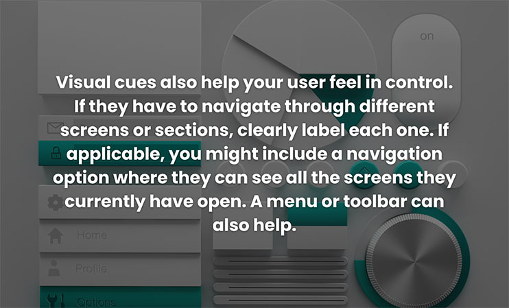
Visual cues also help your user feel in control. If they have to navigate through different screens or sections, clearly label each one. If applicable, you might include a navigation option where they can see all the screens they currently have open. A menu or toolbar can also help.
One of the best ways to give your user control is by allowing them to back out of any action at any time. That may mean including a cancel button, a back button, or an undo option. If they have the option to reverse a mistake, regain deleted content, or back out of a purchase at the last minute, they’re much more likely to experiment with your product without fear of failure.
Comfort
Just like a nice dorm room or cozy AirBnB, you want your product to be a place where people feel comfortable and at home. That means avoiding jargony terms and confusing icons in favor of familiar metaphors. A good example is the recycling bin icon on your desktop: no one has to ask what that means.
Another way to make users feel at home is to make your product accessible. Consider the needs of all your users: including those with impaired vision or hearing. While you may not be able to make your app accessible to everyone, there are plenty of things you can do to accomodate most users. For example, color-blind users may get lost if you use color as the sole way to convey information. Hearing-impaired users will appreciate on-screen text and visible indicators as opposed to just sound effects.
Clarity
Achieving clarity isn’t just about reducing clutter, although a minimalist design goes a long way. It’s also about guiding your user clearly through each step in a process. For example, if they’re making a purchase, you might include a progress bar at the top of the screen that shows the stages they need to pass through: entering payment details, reviewing shipping info, confirming purchase—along with their current progress.
You also want to give a clear response to every action. When your user taps a button, light it up or change its color. Otherwise they’ll be left furiously tapping it over and over again, not realizing their action went through. Anytime your user uploads a document, purchases a product, or swipes to a new screen, they need to know that it worked—preferably, right away.
Finally, don’t underestimate the value of communicating with your user. If a screen takes more than a couple seconds to load, your user will be left wondering what’s going on. A simple loading graphic can work wonders. Other times, you may want to include a brief bit of text to tell the user what’s happening and what (if anything) to do about it.
Consistency
Consistency functions on several levels. First of all is visual consistency. Keep the color scheme, font, and graphics style consistent across your product. A button that was yellow on one screen shouldn’t be purple on a different screen, and a button shaped like a rectangle at the top of the page shouldn’t be an oval at the bottom of the page.
Be consistent in layout and feature placement as well. Users should never be surprised or forced to make a guess. If the menu is located at the top of the home screen, then the menu should be located at the top of every other screen as well.
Another level is functional consistency: or the idea that your product should function in the same way across the board. In other words, don’t have a button light up on one screen and darken on another, and don’t change the way users interact with your product from one screen to the next. While change in life is good, change in digital products is generally bad.
Conquer UI design
While we can’t cover every single thing you need to know about UI design here (sorry), following these general guidelines will steer you right 99% of the time. If you give users control, clarity, comfort, and consistency, your product will already be poised for success.
Need help designing your digital product? Give us a call!
Share this post: